Module 6: Sort and Select
Sort
You can sort tables by clicking on a column header. You can also right-click a visual and choose a sort field and sort direction.
Basic sorting can be ascending or descending. For text, ascending order is usually alphabetical. For numbers, it is lowest to highest or highest to lowest. For dates, it is chronological or reverse chronological.
Sort by column
Sort by column lets you display one column according to the order defined by another column. This is useful when the natural alphabetical order is not the order people expect.
For example, month names may sort alphabetically as April, August, December, February instead of January through December. Create a Month Number column and use Sort by column to sort Month Name by Month Number.
The sort-by-column setting is part of the model, so it affects every visual and page that uses that data field. Check the model-level impact before changing a commonly used field.
Sorting by category allows you to reorder the category axis rather than leaving it in alphabetical or chronological order. You can sort by cost, which puts the highest-cost year at the beginning and the lowest-cost year at the end. This is helpful for FinOps because the most expensive categories become visible first.
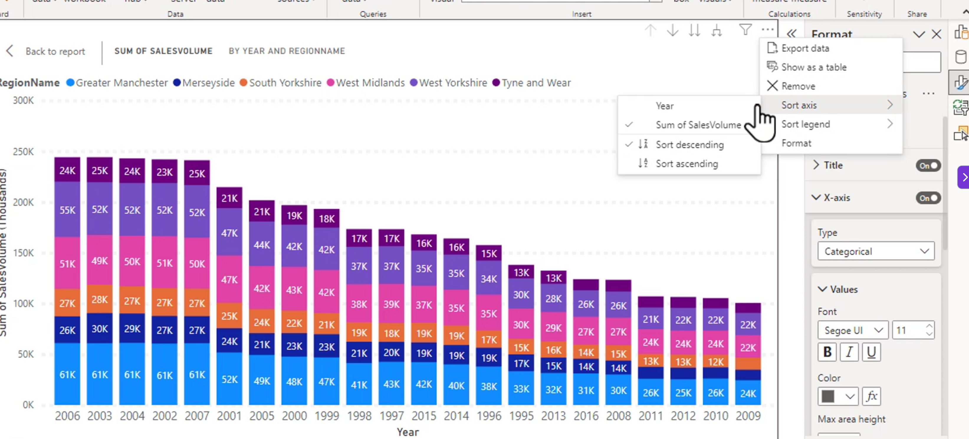
Be careful when sorting by a measure. The order may change as filters and slicers change, so make sure the changing order helps the user understand the visual.
Configure small multiples
You could create one, then copy and paste and change the data for each of the charts like this:
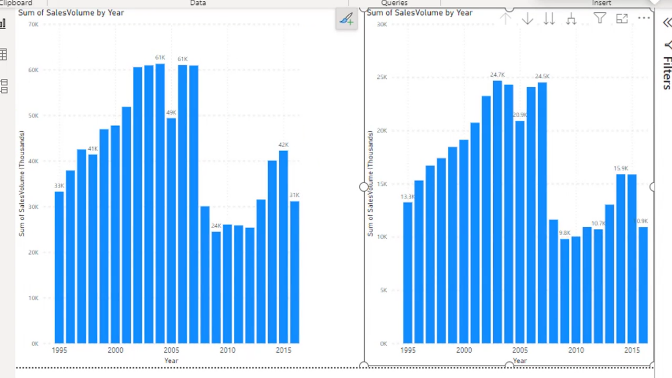
The issue is that the right chart is on a different scale than the left, but it looks the same. Not great. Separate charts can make comparisons misleading when each chart uses a different axis range.
Small multiples are a collection of similar charts split by a category. Instead of creating and formatting many separate visuals, you create one visual and add a field to the Small multiples well.
Trellising, or adding small multiples, creates multiple charts automatically and places them on the same axis. This makes it easier to compare the same measure across regions, products, or other categories.
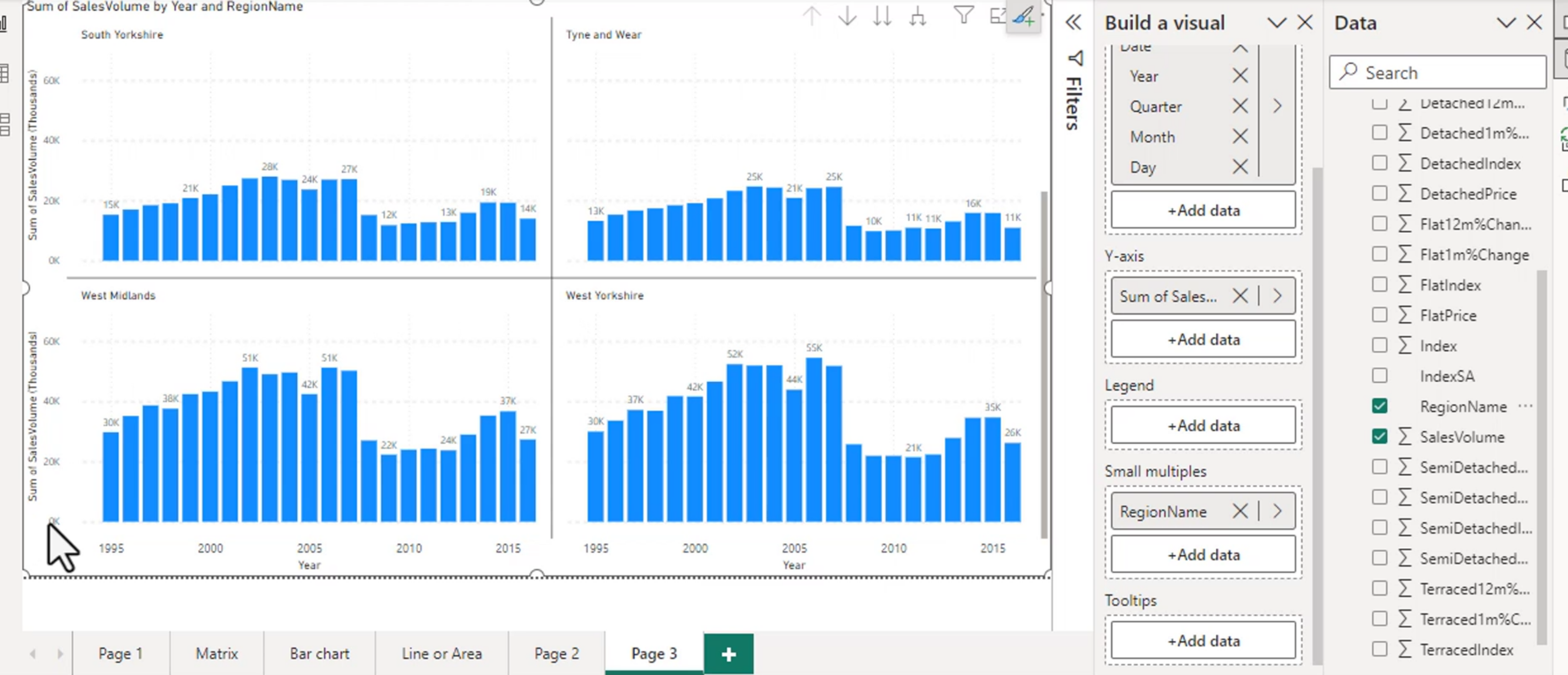
Small multiples work best when each panel uses the same chart type, measures, and scale. Keep the number of panels manageable; too many small charts can become difficult to read.
You can then sort the small multiples on sales volume. This places each graph, not the contents of the graph, in order.
The largest panel appears in the upper left and the smallest appears toward the bottom right.
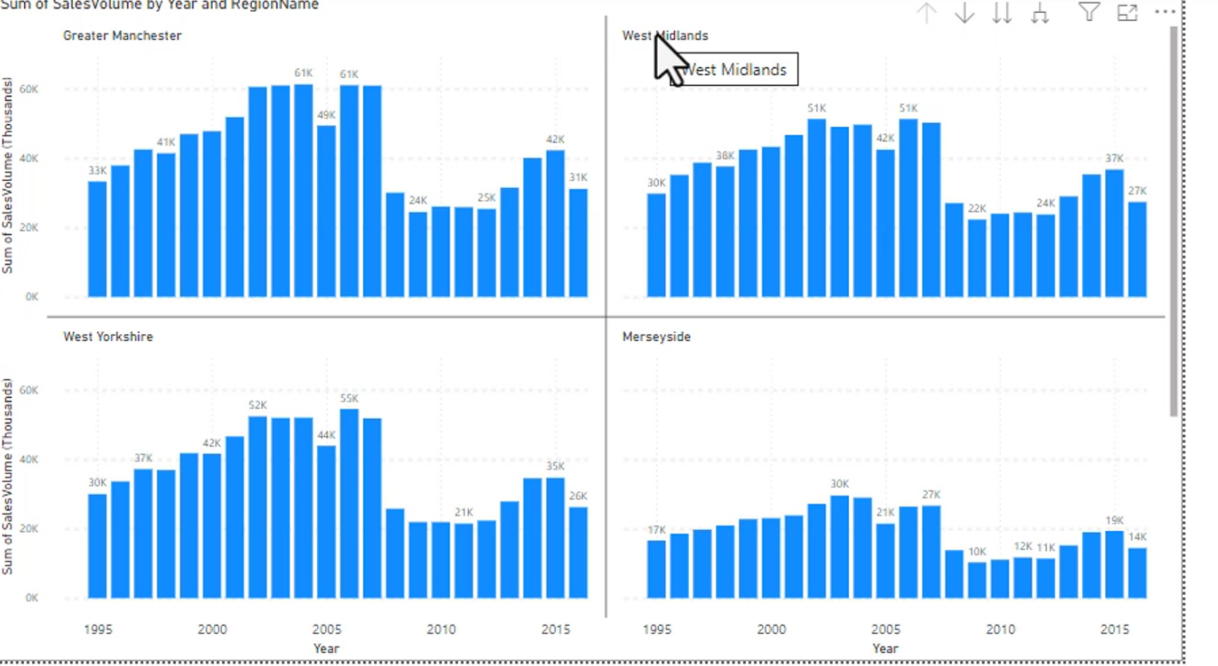
You can format all of these graphs together, including the position of titles, colors, borders, padding, and font. Consistent formatting is important because users compare panels by position and appearance.
Padding:
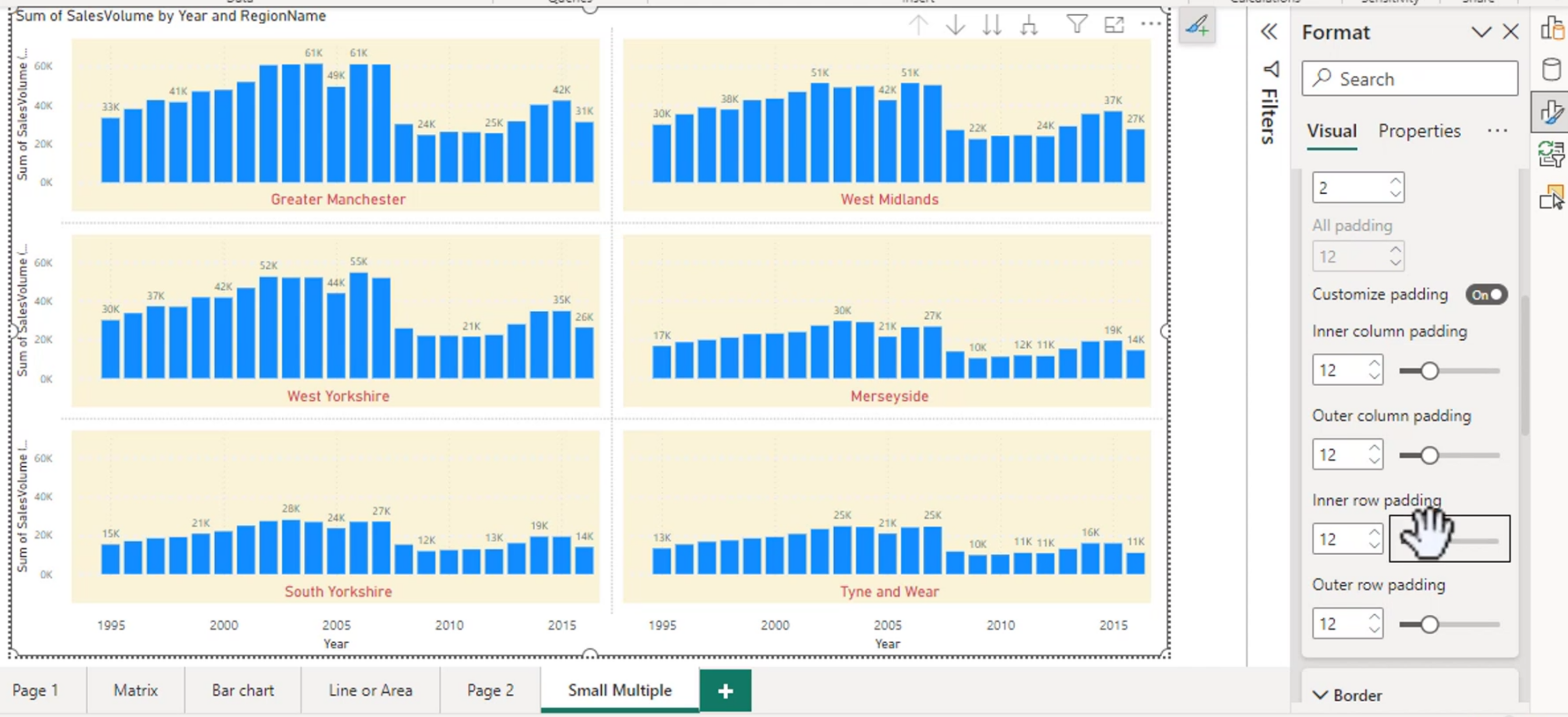
This is pretty cool. Clicking on the chart also allows for the other to be highlighted.
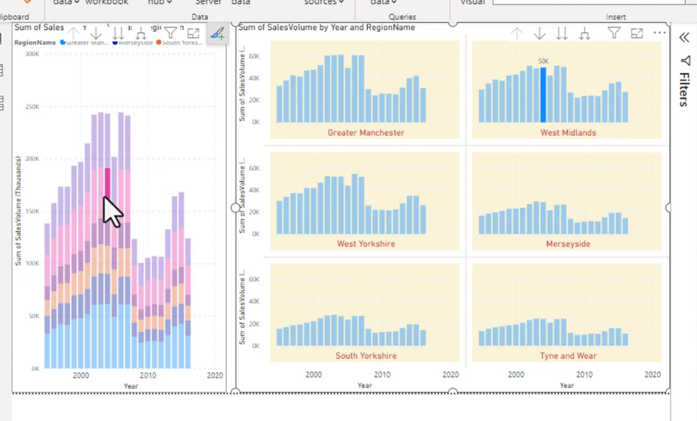
Selecting a data point in one small multiple can cross-highlight or cross-filter other visuals on the page. Use this interaction when it provides useful context, and disable it when it distracts from the comparison.
Bookmarks
Bookmarks are used to save a point where the filters are all changed so that you can click one place without changing 20 different visuals everytime.
A bookmark can capture the current state of filters, slicers, visual visibility, and the page. This allows a report to provide buttons for common views such as Overview, Current Month, or High Cost Items.
Steps:
- Set up your page as you want
- Create bookmark
- Repeat if needed.
After changing the page, update the bookmark so it stores the new state. A bookmark does not automatically update every time the report changes.
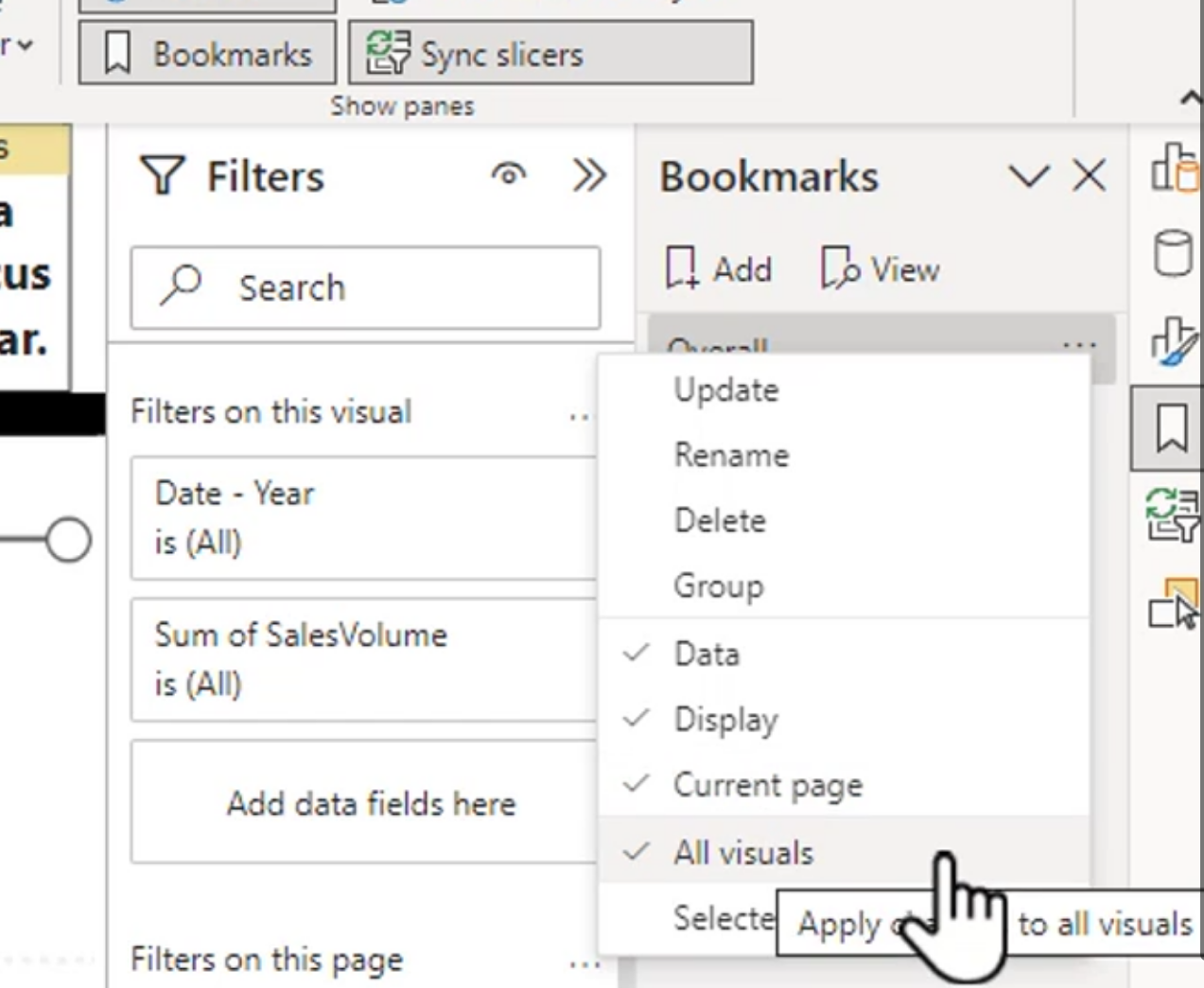
Maybe you don't want your bookmark to affect everything, so in that case, you can select what you want your bookmark to effectively manage.
- Data
- Display
- Current Page
These settings control what the bookmark remembers:
- Data: Filters, slicer selections, and drill state
- Display: Visibility of visuals and other display settings
- Current Page: The page shown when the bookmark is selected
For example, clear Display if the bookmark should change filters but not hide or show visuals. Clear Current Page if the bookmark should work from several pages instead of navigating to one specific page.
Group layers by selection
You can manage the layers of a report by using the Selection pane. The pane shows which visuals are visible and which objects are in front of or behind other objects.
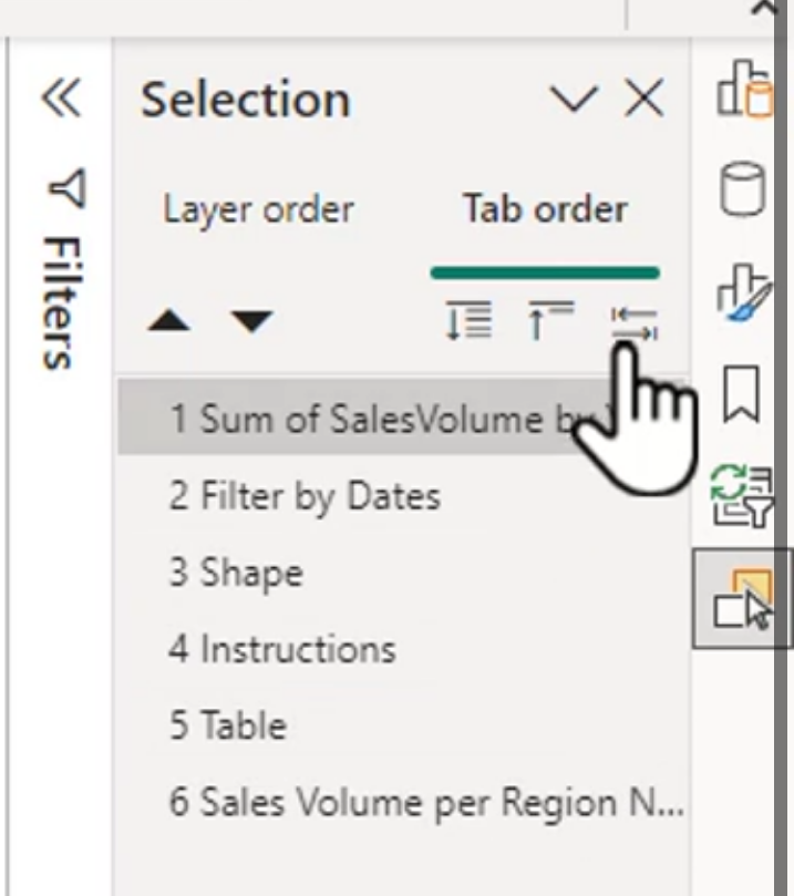
Layer order controls which object is displayed on top when visuals overlap. Move a background shape behind the charts and move buttons or labels to the front so they remain clickable.
Tab order controls the order in which objects receive focus when a user navigates with the keyboard. Remove decorative objects from the tab order when they do not provide useful information.
You can also group related objects, such as a title, icon, and background shape. Groups make it easier to move or hide several objects together.
The Selection pane is a good place to inspect layers, rename objects, hide visuals temporarily, and correct overlapping visuals. Clear names such as Sales Chart or Overview Button are much easier to manage than default names like Shape 14.
Quick Demo: FinOps Cost Review
This demo uses sorting, small multiples, bookmarks, and the Selection pane to create a simple cost review report.
1. Build the cost table
- Add a table or matrix with
Year,Category, and aTotal Costmeasure. - Sort the table by
Total Costin descending order so the most expensive items appear first. - If the report contains month names, create a numeric month-order column and use Sort by column to display the months from January to December.
2. Create small multiples
- Add a line chart with
Monthon the X-axis andTotal Coston the Y-axis. - Add
Cost Categoryto the Small multiples field well. - Sort the small multiples by total cost in descending order.
- Format the panel titles, borders, padding, and labels so each chart is easy to compare.
The result is one consistent trend chart per category, with the highest-cost category in the first panel.
3. Save bookmark views
- Create an
All Costsbookmark with no category filter. - Apply a filter for the highest-cost category and create a
High Costbookmark. - Create a
Monthly Reviewbookmark with the page set to the detailed monthly page. - Decide whether each bookmark should remember Data, Display, and Current Page.
Add buttons or a Bookmark navigator so users can switch between the saved views without rebuilding the filters manually.
4. Clean up the layout
- Open the Selection pane and rename the main visuals.
- Move background shapes behind the charts.
- Keep buttons and important labels at the front of the layer order.
- Review the tab order and remove decorative objects from keyboard navigation.
The completed workflow is: sort costs to find the largest items, compare category trends with small multiples, switch between saved views with bookmarks, and use the Selection pane to keep the report organized and accessible.